JR Partners
A restrained corporate identity and website for an executive search firm: calm, not dull, and with no faces in sight.
- Client
- JR Partners
- Service
- Logo, identity & website
- Year
- 2024
- 01The challenge
- An American executive search firm that places people in senior roles asked for a restrained, simple corporate identity and website that would not feel dull, and for imagery without faces: they did not want any picture to single out a race or an appearance.
- 02The idea
- Show people, never faces. Everyone in the pictures is in motion, blurred or in silhouette: a crowd crossing a lobby, a team against a window, hands over a table. The movement stands for the people, and anyone can see themselves in it.
- 03The solution
- A J and an R joined into one sign; deep navy and black with one bright blue for the words that matter; large, quiet type; photography toned blue and grey so the whole site reads as one.
- 04The result
- A calm site that says what the firm does in one line, gives its numbers room and lets its values take turns, corporate without being cold, built in Webflow.

01The mark
A J and an R joined into one sign: the J in bright blue, the R in deep navy.
PARTNERS stands beside it or beneath it, set wide and calm.


Vertical on white, horizontal on navy
02The colour
Bright blue for the J and for one word in every headline; deep navy and white for everything else.



03The photography
People are in every picture, but never a face: a crowd crossing a lobby, a team against the light, hands over a table, three silhouettes leaving a building.
Toned blue and grey, the pictures read as one, and no one is singled out.




Photography: people in motion, never a face
04The website
Built in Webflow: a dark, quiet site where people move behind the words, and no face but the founder's is ever shown.
The first screen says it in one line, Strategic Talent Solutions for Global Markets, with the key words in blue; the values take turns, the numbers count up, the reasons light up one by one.
The home page
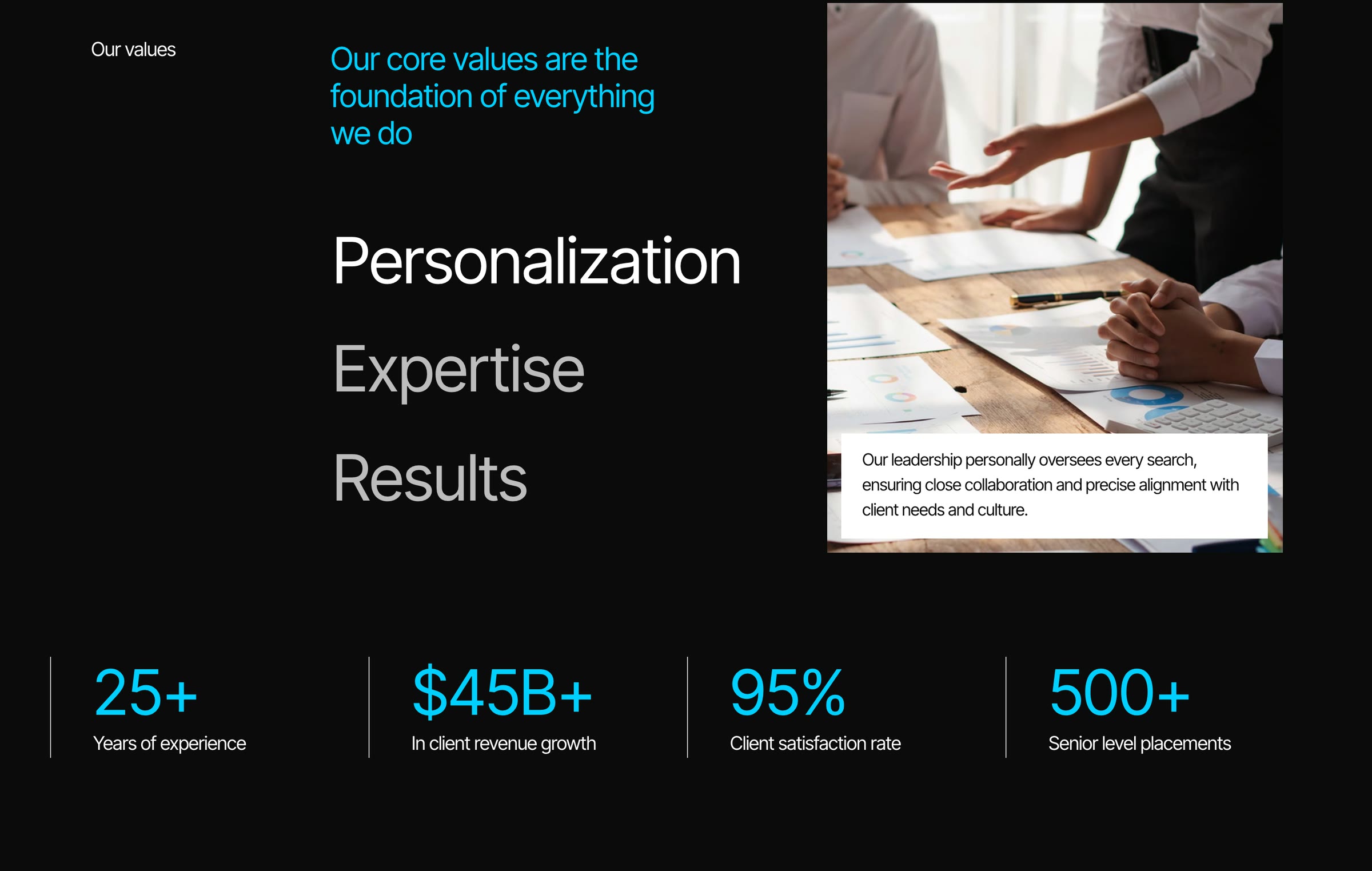
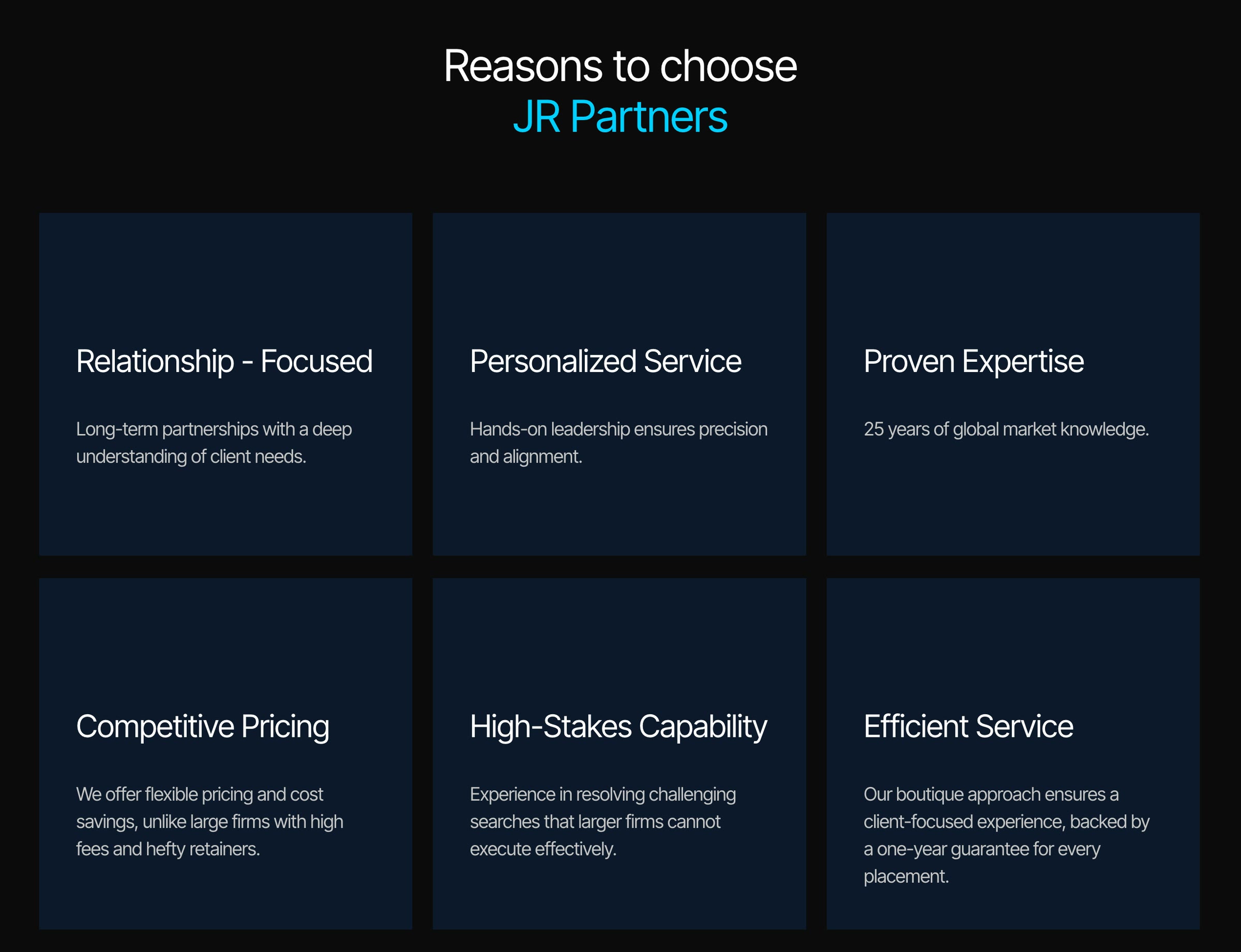
The values and the reasons
On a laptop and a phone
The phone layout
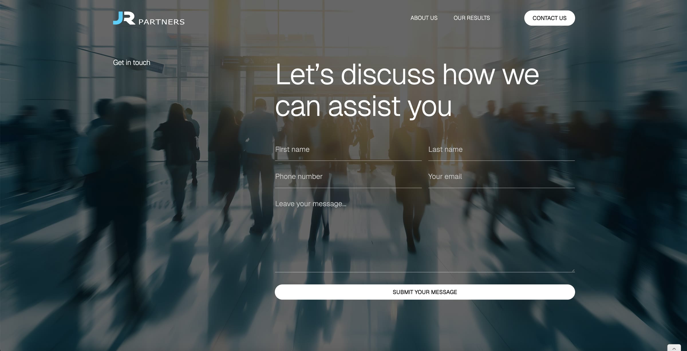
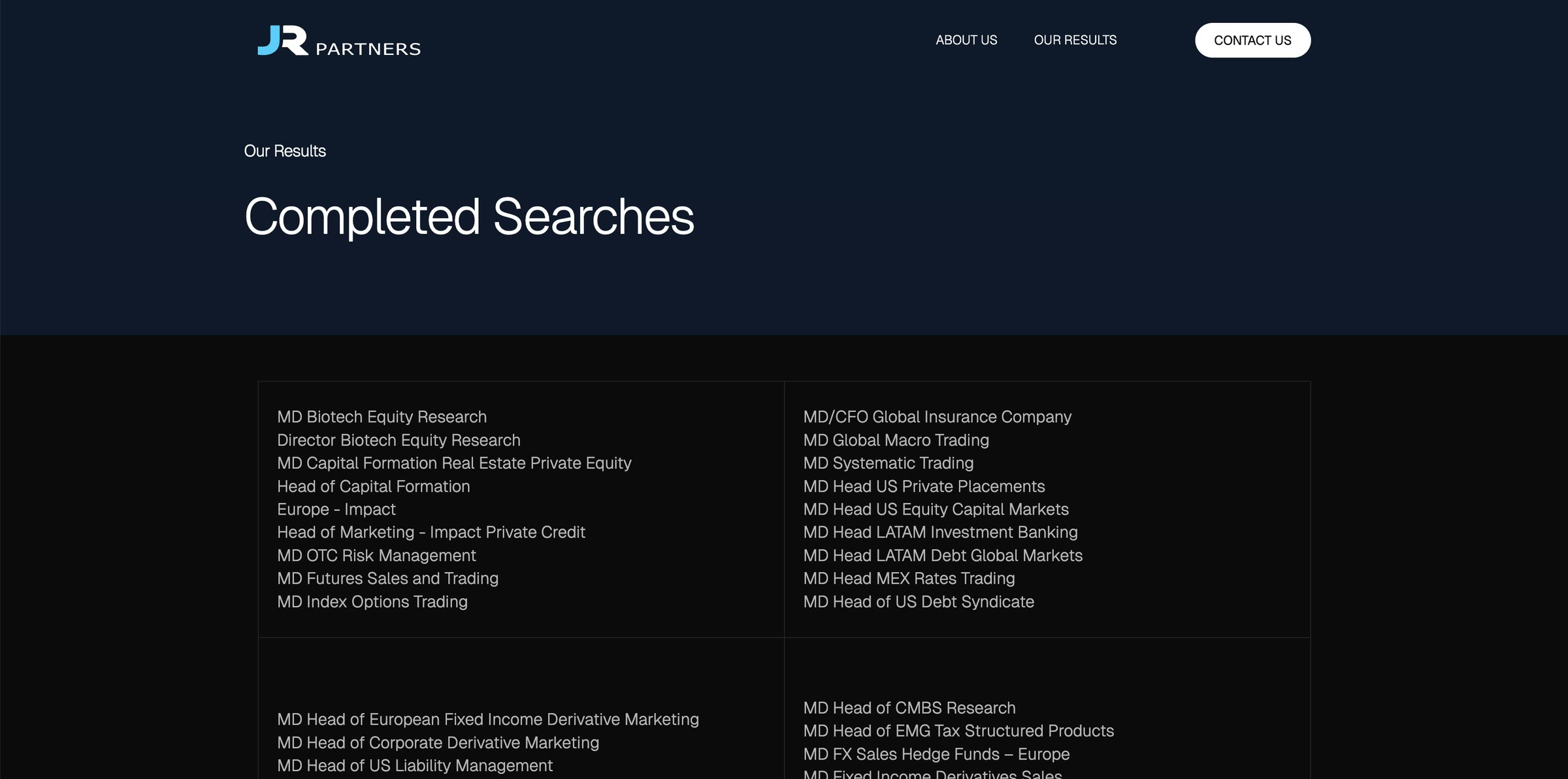
Contact and the completed searches, from the Webflow site
Global reach. Boutique precision.
- Client
- JR Partners
- Design
- Uyáva Studio
- Built in
- Webflow
- Year
- 2024