Zillow
A calmer Zillow: one search on the first screen, and every section after it doing one job.
- Client
- Concept, not commissioned
- Service
- Website design, UX/UI
- Year
- 2025
01The brief
A conceptual redesign of Zillow, the leading US real-estate platform: a clearer, more modern interface and simpler navigation, keeping the brand people already trust.
A personal project, made to show how we approach a website. Zillow was not a client.
- Research
- Moodboard
- User flow
- Wireframes
- UI design
02The problem
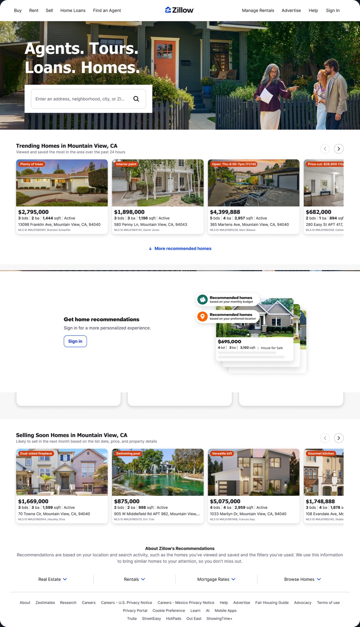
The old site looked cluttered: weak hierarchy, faint calls to action, crowded sections and uneven spacing pulled people away from the one thing they came for, a home.

03The solution
A clean layout built around one search on the first screen, clearer calls to action, and a flow that reads: about, properties, agents, what clients say, questions.
3D illustration, modern type and even spacing build trust on every device.
The home page
04The system
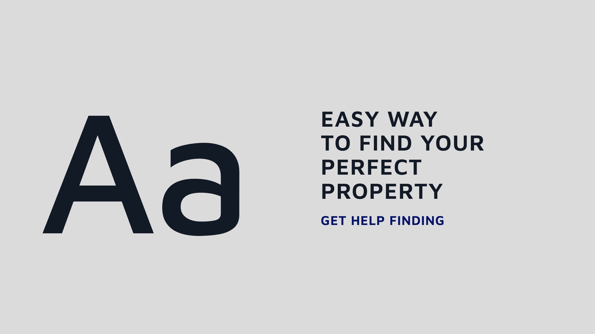
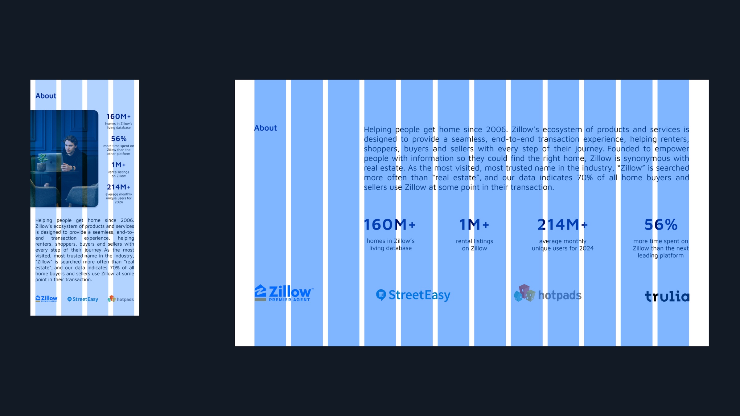
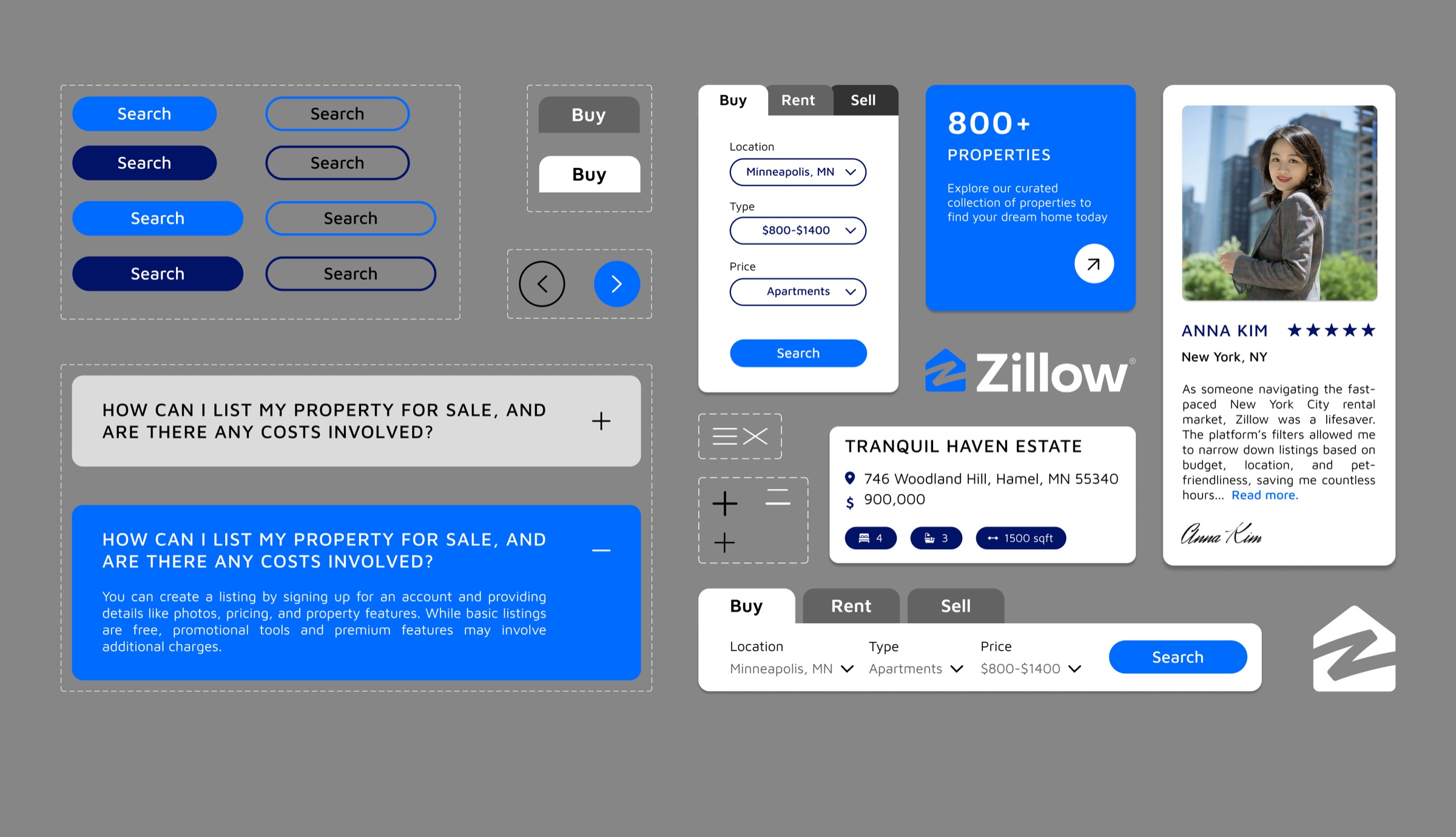
One typeface, Maven Pro, in capitals for the headlines. Five colours led by a bright blue. One grid and one set of components shared by the phone and the desktop.
05Every screen
Designed for the phone first, then the desktop: the same search, cards and questions, sized for the thumb.

Phone first
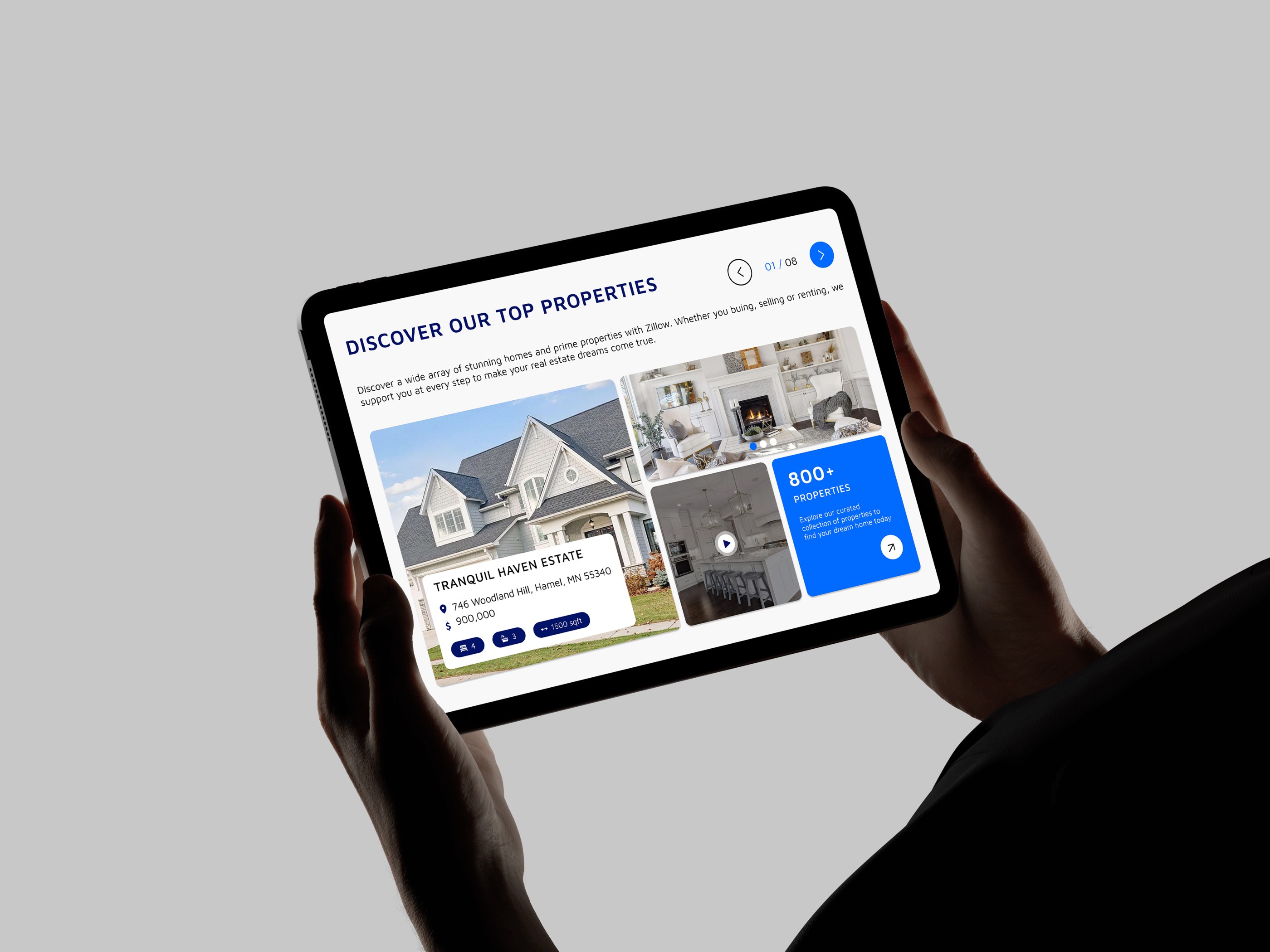
Then the tablet and the desktop
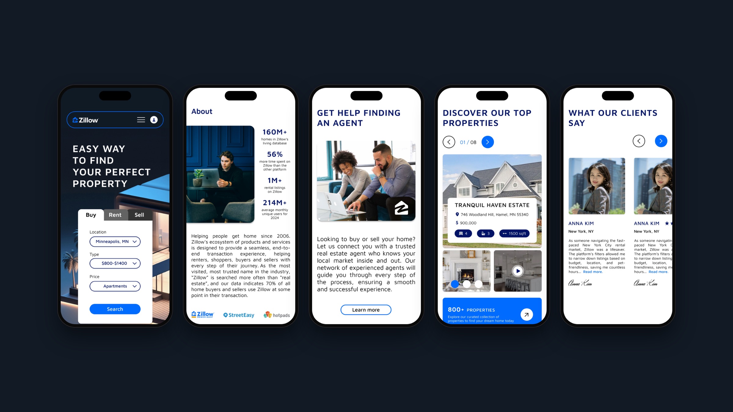
Made for the thumb, screen by screen
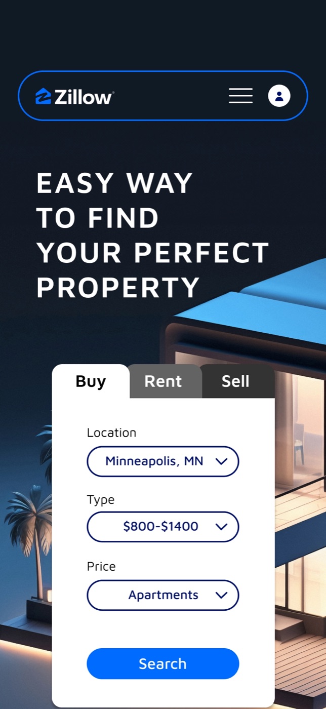
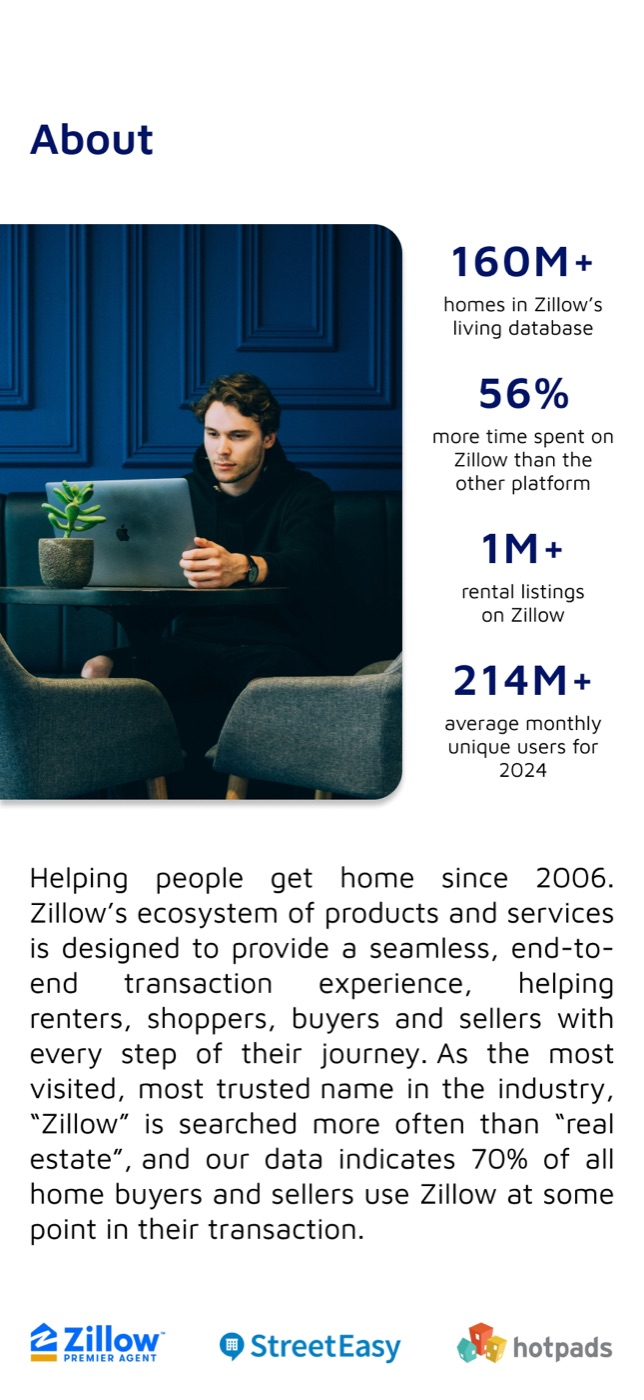

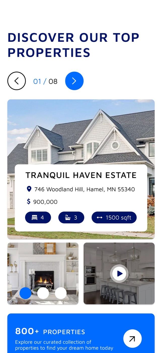

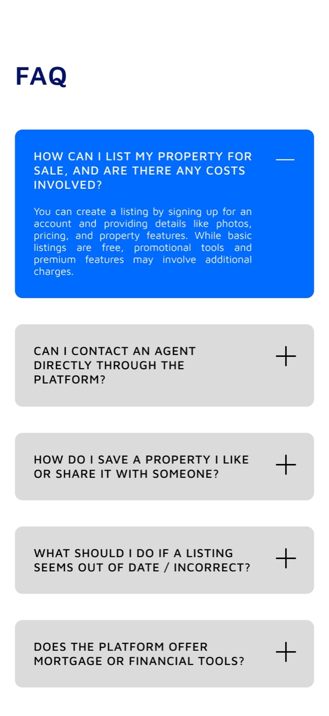
The site on a phone, screen by screen

- Client
- Concept, not commissioned by Zillow
- Design
- Kristina Kurynytska, Uyáva Studio
- Typeface
- Maven Pro by Joe Prince
- Year
- 2025